Kids Room Personal Space Gender Neutral Nursery
This Nursery Is the Ultimate Inspiration for Gender Neutral Design
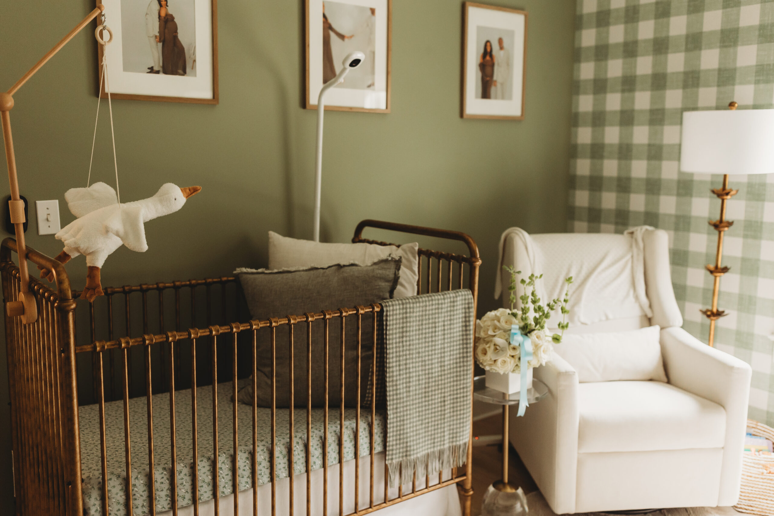
The gold and green color scheme is a serious match made in heaven.

Designing a nursery can feel like you’re limited to specific colors and themes, when in fact, it’s quite the contrary. Expanding the color wheel and staying true to your personal design style can allow you to create a space that stands the test of time and actually feels cohesive with the rest of your home. If you’re looking for inspiration for a space of your own, allow this Atlanta nursery to be your guide.
Location: Atlanta, Georgia
Occupation: Journalist
With its gingham wallpaper accent wall, vintage gold pieces and cream furniture, this nursery is the epitome of timeless Southern charm. The star of the show is easily the crib—complete with a matching gingham throw blanket, dainty floral sheets and a goose mobile, it really doesn’t get much cuter than this.
This nursery is proof that you can have a space that aligns with your aesthetic and becomes one that, above all else, becomes a cherished backdrop for each and every moment spent with your newborn.
How would you describe your design style?
Classic with a touch of Southern charm.
Describe what you love most about the space and why.
We didn’t know if we were having a boy or a girl, so creating the nursery was a lesson in neutral design. It was a fun challenge to pick pieces that we felt could accommodate whatever child we had.
Where did you purchase the majority of the furniture and decor in this space?
It was a real range. Our crib and changing table came from a brand called Namesake. Our rocking chair was from the popular baby brand Babyletto. That was our biggest splurge if you can call it that since it was a gift from family. It is a power recliner, and while I debated greatly on whether or not to add it to our registry, I am glad we did. My favorite piece, our daybed, was actually purchased from a home stager who was liquidating some of her items on Facebook Marketplace. It was basically unused, and I was able to score it for about half the original price.
What’s your best advice for helping others achieve a look like yours?
Simplicity is key! I love adding one or two eye-catching elements to help ground a room and then letting neutrals do the rest of the work. Also, if you’re considering it, don’t be afraid of wallpaper. However, if you, like me, don’t like a challenge, GET SOMEBODY ELSE TO DO IT. We hired the job out for roughly $500 (not including the paper) and it was money well spent.
What is one piece in this space you feel like you couldn’t live without?
Our daybed for sure. Countless nights have been spent on it, and it is ultra-comfortable.
What are your signature design elements or personal touches that make your space uniquely yours?
I’d say the wallpaper. We went with just one wall, which is a nice accent without being overwhelming.
So, are you ready to deck your nursery in gingham and green? To stay up to date with the creator behind the space, follow her on Instagram at @jolie_ari. For more design inspiration, follow @homeandtexture on Instagram, Facebook, and TikTok.
Find us on social for more home inspiration where culture, personal style, and sophisticated shopping intersect to help you create a home where you love to live.