Thanks to hours of watching HGTV, many of us have gained insight for spatial awareness, complementary tones in a room and simple ways of making a room feel updated. If you haven’t gotten into HGTV and are looking to make a few manageable changes, you’re missing out! However, if a quick article that gets to the point feels better than a show episode, then you’ve come to the right place.
Home decor is a matter of expression, but it’s also a skill that takes a bit of practice. Mistakes are part of the process — the next step is figuring out ways to rectify them. Here are 5 common home decor mistakes and the must-have statement pieces to fix them instantly.
Mistake 1: Matchy Furniture Sets
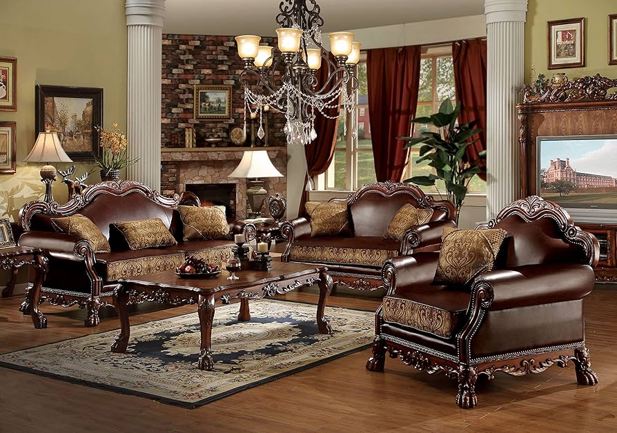
These days, capturing your style through home decor makes all the difference. It sets the tone for the mood you’re trying to evoke and pays homage to eras that impacted you early or late in life. Our grandmother’s and mother’s practices don’t have to be ours, especially when they limit us to negating play from the decor experience. Sure, pieces can complement each other, but they don’t need to be the same for the house to flow throughout.
A statement table with similar tones to your trinkets or a bold colored chair to match the pattern of your wallpaper will remind you to have fun while expressing to your guests that they can too. Say it with me: coor-di-na-tion!
Mistake 2: Minimizing Style For Cleanliness Or Durability

When we think about whether a piece of furniture or statement piece will survive our children, child guests or pets, we’re limiting ourselves! And we’re not tapping into the wide range of options that combine style and durability.
Believe it or not this one of the 5 most common home decor mistakes, but it has a must-have statement piece that fixes it instantly too! Think coverings!
Sofa covers have become increasingly durable while still offering the stylish details like velvet or linen to the look. You can go bold with colors or something demure and mindful – yes that can apply here too! You can also consider adding rugs to your space that incorporate color and print that brings your furniture to life or acts as the main attraction.
Mistake 3: Not Considering Scale When It Comes To Your Space
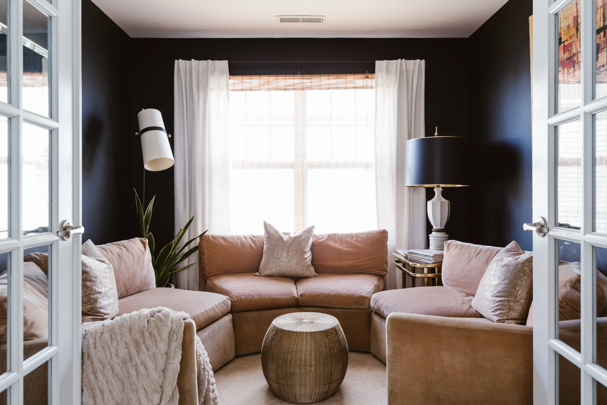
If a space is small, don’t overcompensate with bigger furniture or try to accommodate with tiny pieces either. There’s a happy medium hidden in there, it just takes a bit of finesse. It can be achieved through a statement piece. Consider moderately sized sofas, chairs and tables with bold colored accessories like brass or teal.
Then bring all of that to life with a large mirror that you can lean against a corner in your main room or in the center of a wall. Mirrors will make small spaces feel bigger without being in the way of flow. You can stick to more modern, clean lines with a solid colored border or something baroque or squiggly if you feel the need to add more character.
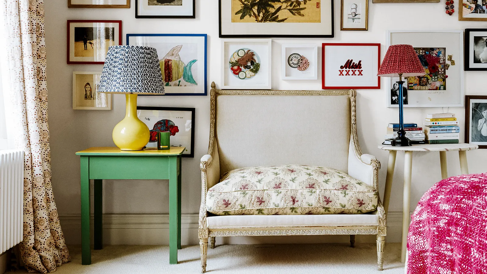
Mistake 4: Hanging Pictures Too High or Low
There are apps for this now! If you need a hand with hanging photos, there are apps that offer measuring properties. There are also some that will offer styling tips using your camera.
Deciding the right height for your artwork, family photos, and favorite prints can be tough. If your pictures are hung too high, they draw the eye up and possibly to a point where the viewer can’t even make out the details. Hanging them too low is also a home decor mistake in that if they’re behind a sofa, they could impact comfort for yourself or your guests.
A statement piece to fix this home decor mistake easily are multiframe pieces and gallery walls. Think triptychs and diptychs. If you’re in the mood for DIY, you can glue your preferred frame sizes together and paint them your desired color. This potentially requires a little sanding, but it’s worth the effort. DIY wall art is always a crowd-pleasing statement.
Seeing as they also come constructed already, you can make your selection according to how many frames are needed and which wall you’ll hang it on to create a moment of gratitude and/or serve as a focal/talking point.
Mistake 5: Busy or Plain Countertops
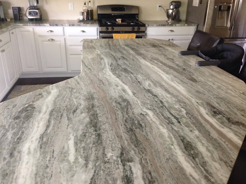
Countertops, although not furniture, draw the eye as well and set the tone for your kitchen space. Choosing a busy one to avoid the area looking dirty or a plain one to avoid considering several options. Truthfully, neither of these are preferred in the long run. Printed countertops can offer complement to your kitchen appliances and colorways while still coming second to the rest of the decor in this area. Solid countertops can do this as well, helping to draw more attention to the rest of the space.
In both cases, choosing what you want and committing is most important. Style and durability are achievable no matter the part of the house. It doesn’t need to be matchy, boring or busy. Complementary and coordination are key when it comes to these 5 common home decor mistakes and the must-have statement pieces to fix them instantly.
popular posts
Decorate
Access design inspiration that infuses personality and culture into your spaces.
FOLLOW ALONG ON INSTAGRAM
#homeandtexture
Find us on social for more home inspiration where culture, personal style, and sophisticated shopping intersect to help you create a home where you love to live.
