By Kelsey Marie
February 26, 2026 at 4:55 PM PST
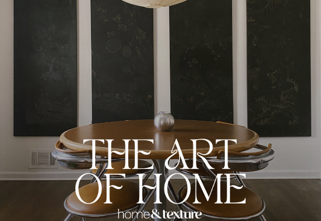
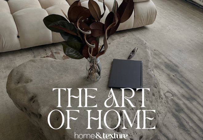
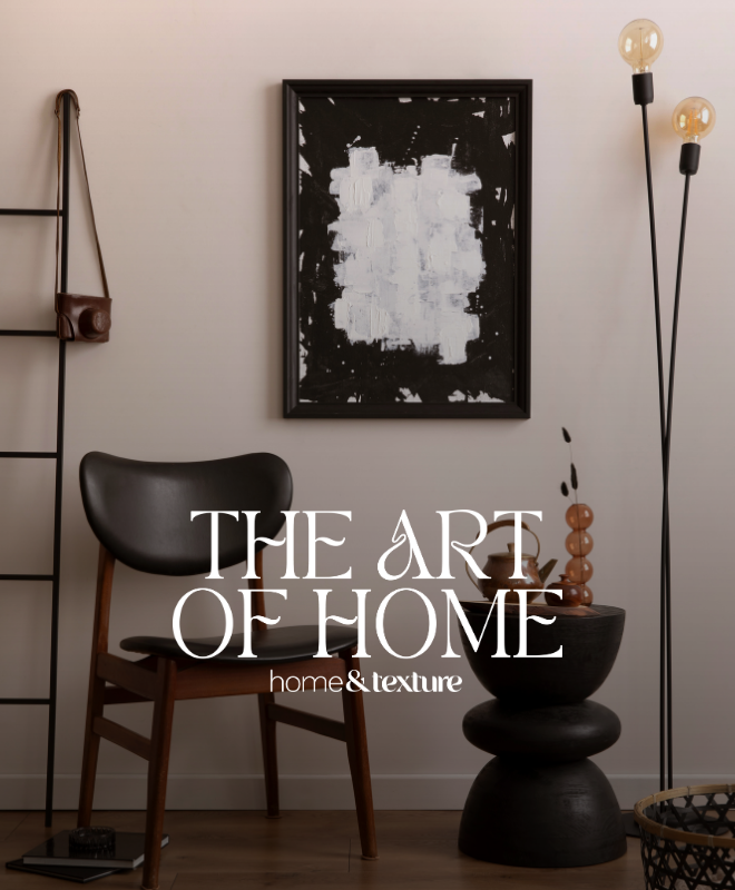
An easy guide to spacing, height, and placement for walls that feel thoughtfully curated.
An easy guide to spacing, height, and placement for walls that feel thoughtfully curated.
Art may be subjective, but placement absolutely is not. While there’s no single “correct” piece of art for a space, there are dependable guidelines that make artwork look intentional instead of accidental. The difference between a room that feels thoughtfully curated and one that feels slightly off often comes down to spacing, height, and proportion.
Hanging art well is more about visual balance, flow, and understanding how the eye naturally moves through a room than rigid rules or perfection.
Once you understand a few core principles, arranging art becomes far less intimidating and a lot more instinctive.
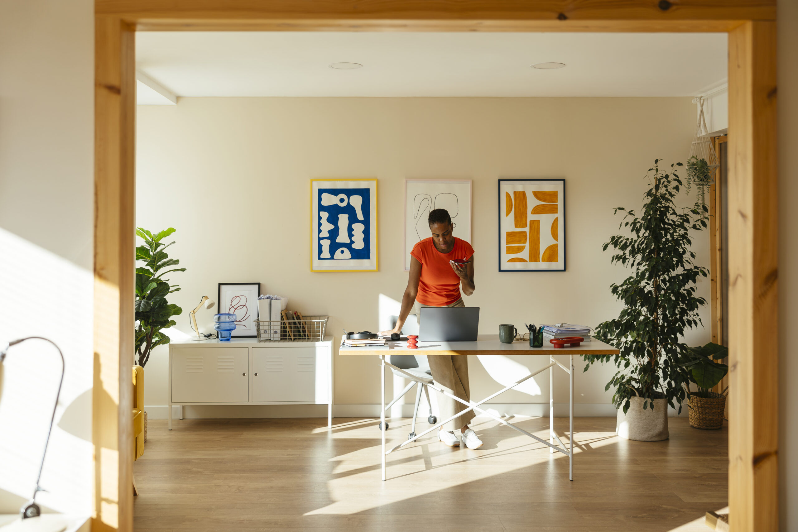
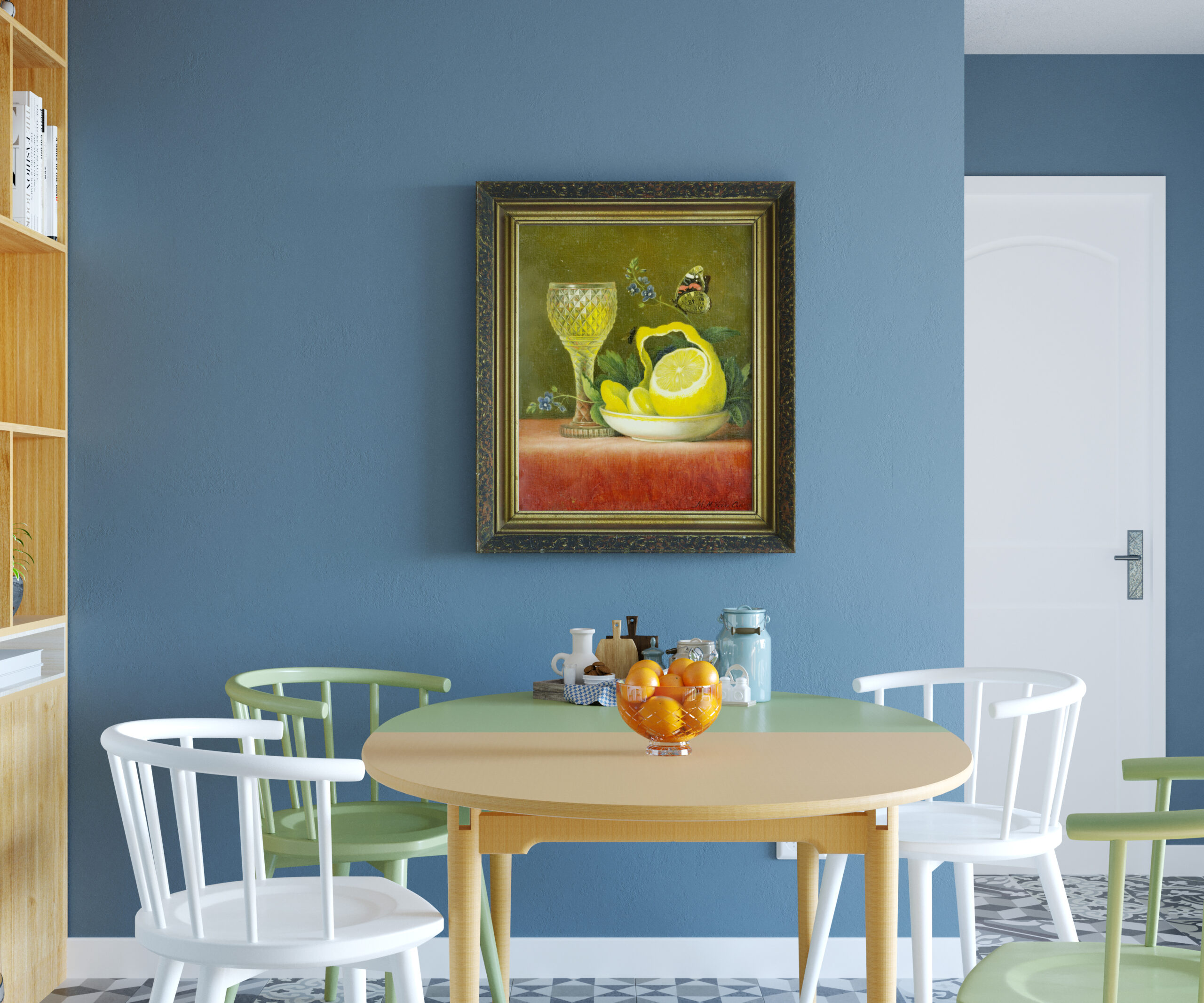
The most reliable rule in art placement is also the simplest: hang art at eye level. In most homes, this means positioning the center of the artwork roughly 57 to 60 inches from the floor. This range aligns with natural sight lines and prevents the common mistake of hanging pieces too high — a habit that instantly makes a room feel disjointed.
Art that floats too close to the ceiling creates visual distance rather than connection. Art hung too low can feel heavy or awkward. Eye-level placement creates harmony because it mirrors how we actually experience a space.
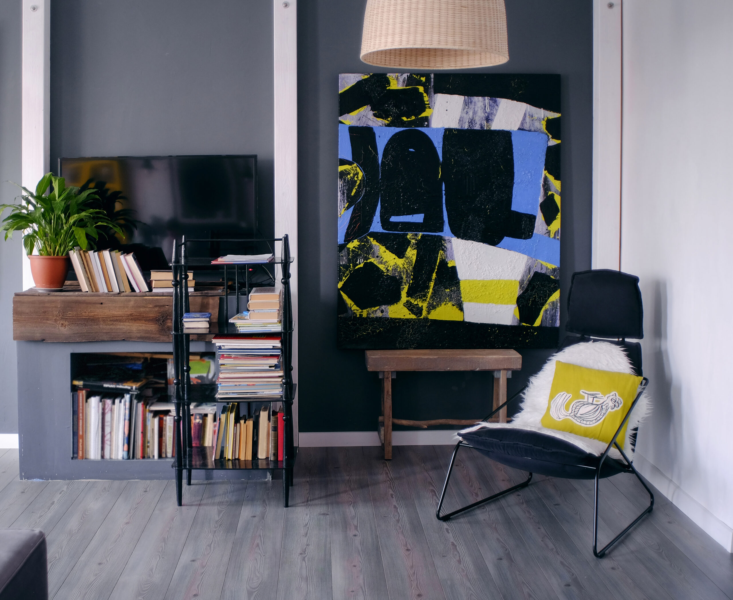
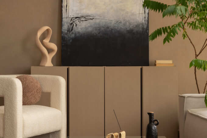
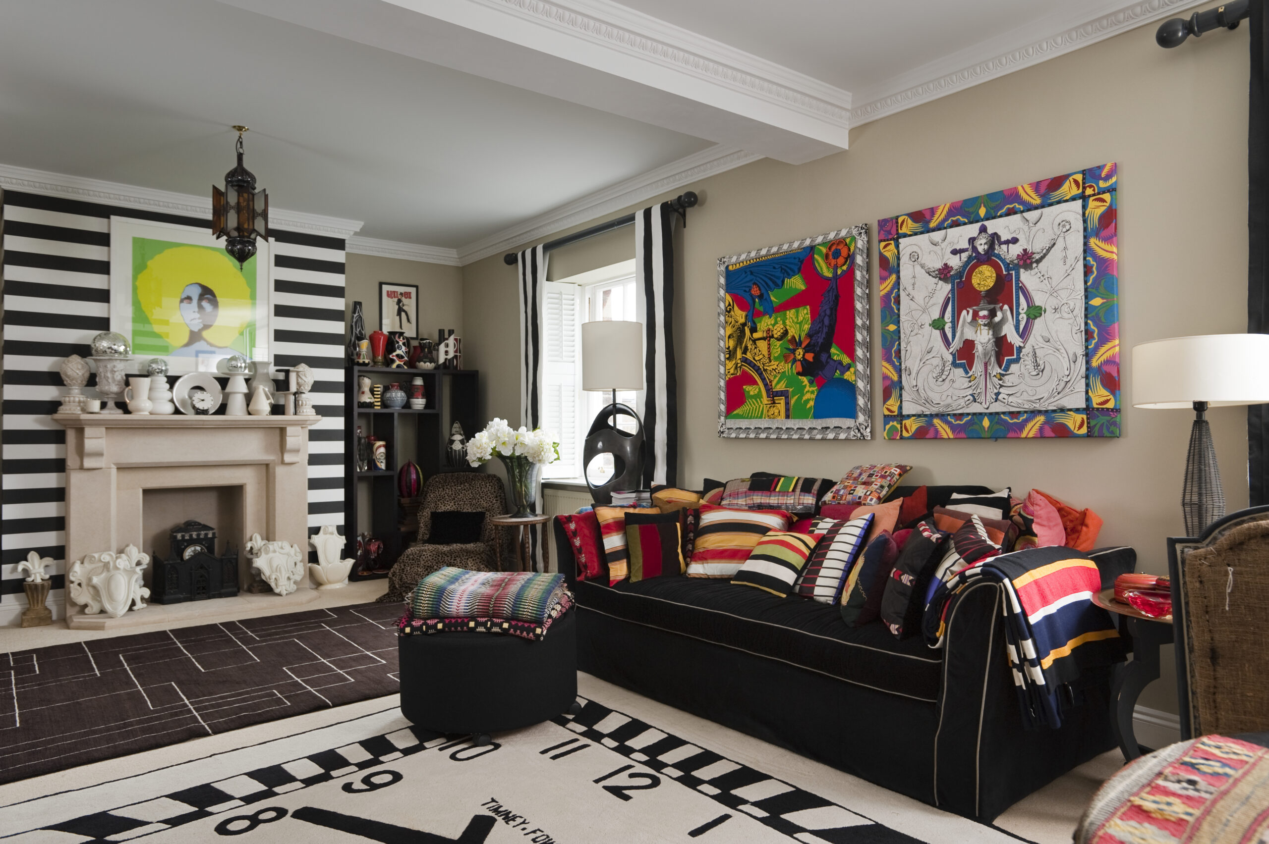
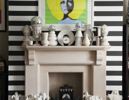
Artwork rarely exists in isolation. It almost always interacts with furniture. When hanging art above a sofa, console, bed, or sideboard, the piece should feel visually connected to what sits beneath it. A reliable guideline is to leave 6 to 10 inches of space between the bottom of the frame and the top of the furniture.
Too much gap creates a “floating” effect. Too little gap feels cramped. The goal is cohesion — allowing art and furniture to read as part of the same composition rather than separate elements competing for attention.
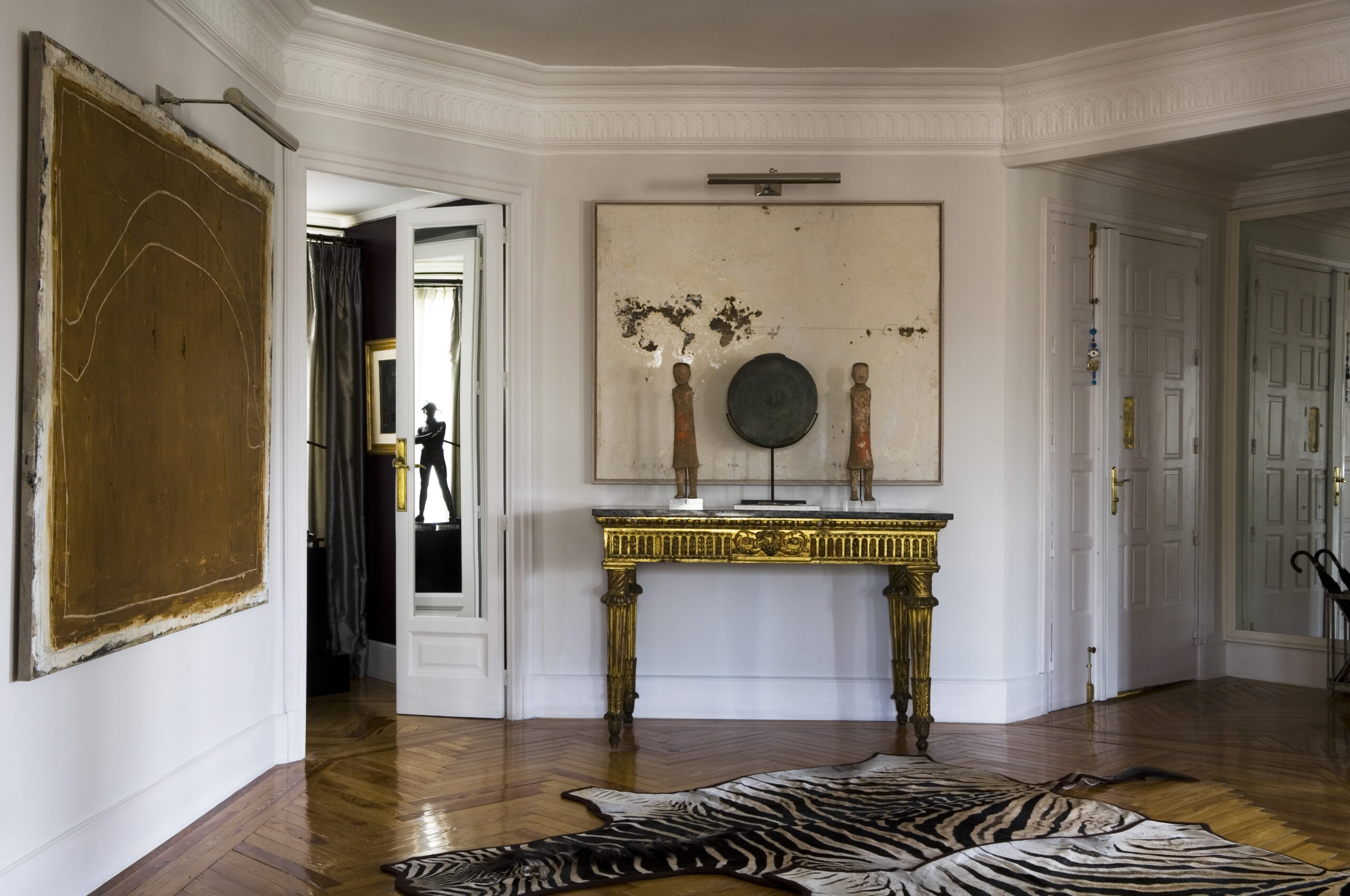
One of the most common design missteps is choosing art that’s too small for the wall. Artwork should generally occupy two-thirds to three-quarters of the width of the furniture below it. A narrow frame above a wide sofa instantly feels out of proportion, no matter how beautiful the piece itself may be.
Larger walls call for larger statements or layered arrangements. Smaller walls benefit from restraint. Proper scale creates visual confidence. Undersized art often reads as hesitation.
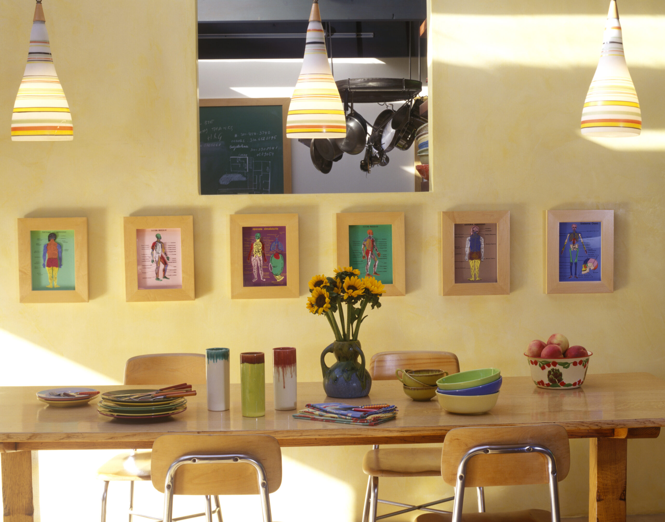
Whether working with a pair of frames or a full gallery wall, spacing is where visual polish lives. A consistent gap of 2 to 4 inches between frames typically creates the cleanest result. Wider spacing can feel fragmented. Extremely tight spacing can feel cluttered.
Consistency is what the eye responds to. Even eclectic collections benefit from structured alignment.
Great art placement is about how everything works together. Gallery walls, stacked arrangements, and layered pairings succeed when they’re treated like a single visual unit. Instead of hanging pieces one by one, imagine an invisible boundary around the entire grouping and align the composition as a whole.
This approach prevents the scattered, “added over time” look that often makes walls feel chaotic rather than curated.
Art is personal. Placement is strategic. Some homes thrive on symmetry. Others lean into playful asymmetry. Some walls benefit from bold statements, while others feel best with subtle layering.
Well-placed art feels natural and connected to the space. It supports the room rather than distracting from it. Because while taste is subjective, balance rarely is.
And once you understand how spacing, height, and scale work together, your walls start to look less decorated and more intentional — which is really what thoughtful design is all about.
Explore the artists, exhibits, and collections shaping contemporary art in homes and galleries around the world.

by Stixx Matthews | November 27, 2024

by Savannah West | February 14, 2024
Whether it’s luxury or ease, every area of your home should be as fabulous and unique as you.
by Kelsey Marie | February 5, 2026
Find us on social for more home inspiration where culture, personal style, and sophisticated shopping intersect to help you create a home where you love to live.