July 4, 2025 at 4:39 AM PST
Decorate Color Duo Trend
Designers Swear by This Bold Two-Color Paint Trick
Create a space that feels fresh and dynamic with this vibrant approach to wall color.

Decorate Color Duo Trend
Designers Swear by This Bold Two-Color Paint Trick
Create a space that feels fresh and dynamic with this vibrant approach to wall color.
July 4, 2025 at 4:39 AM PST
It’s safe to say that we’ve moved past boring and drab paint colors. Now, don’t get me wrong, minimalist aesthetics are still prevalent, but the idea of using color to define a space has become the go-to trend lately. Color drenching has completely transformed the way we approach painting a room. It’s been one of the year’s top trends, so it only makes sense that the color duo trend would come to life. Like color drenching, this approach involves saturating walls with vibrant tones. However, there is a twist. Instead of a single bold hue, it features two for a dramatic effect.
Using complementary colors is nothing new when it comes to painting interiors. Shades are often paired together for walls and accompanying trim. Still, the color duo trend feels fresh and modern. Instead of settling on a color to make a bold statement, the goal is to choose tones that evoke a cohesive feeling. Finding the right match can be difficult, which is why we’ve come up with a quick guide. Below, learn more about color duos and how to recreate this trend.
@interior_ideas Orange and Blue Bedroom Design Ideas
Blue & Orange
Basic color theory states that these two colors can be a perfect match. Blue and orange are located opposite each other on the color wheel, which makes them an ideal pair. As true complementary colors, they can create a striking contrast and give a room a lively and interesting appearance. However, there are rules that apply when working with shades of blue and orange. The first is balance. Pairing such bold shades needs to be done in harmony so they don’t overpower each other. Using one as a dominant hue and the other as an accent ensures they play together nicely.
@chez.shez The dining room is @COAT Paints Yellow Beige and the living room is India yellow. Before this they were plaster and terracotta but i just fancied a change. YELLOW is the future, i feel it 😂💛 #diyhomeprojects #interiordesignmasters #yellowlivingroom #interiordesign #interiordesignmastersseries5 #myhomestyle
Yellow & Brown
These two colors can be exceptional together when you use the right shades. A bright sunny yellow works well with brown, but isn’t ideal for bringing out the richness of the color. A deeper mustard hue with warmer undertones is a better choice. When paired with an equally deep brown, such as chestnut or espresso, it evokes a vintage glamour and retro vibes.
@artin.one Amazing sofas stands out as the centerpiece of an opulent, dark-themed living room, creating a luxury and eye-catching contrast design by @artin.one . . . #luxurydesign #darkinterior #decor #interior #interiordesign #sofa #orange #luxuryliving #homedesign #darkinteriors #luxury #luxuryhomes #homedecor #orange #darkdesign
Dark Gray & Orange
If you’re looking for a moody duo to transform your room, consider your search over. This color combination is not for the timid, but it will turn heads and keep the conversation going. While both gray and orange can have a lighter nature, this look embraces the darker elements of each shade and creates a dynamic match. Each color feels sophisticated on its own and infuses opulence into the room when paired with textural elements.
https://www.tiktok.com/@daisydovewood/photo/7460656588446059822
Red & Green
There’s a reason these two colors work so well for holiday-themed decor, but there’s beauty to be found in this duo outside of the holiday season. For instance, blue and orange, as well as red and green, are also true complementary colors. Sitting opposite each other on the color wheel means they can create a vivid pair, but need to be matched with caution. Lighter shades, such as sage and rose, work well together due to their muted undertones. Burgundy and forest green are another example that follows this logic, only with deeper undertones.
@valerie_sanders It turned out cuter than I was even imagining 😭💗 #kitchenrenovation #pinkkitchen #homedecor #kitchendecor #amazonfinds
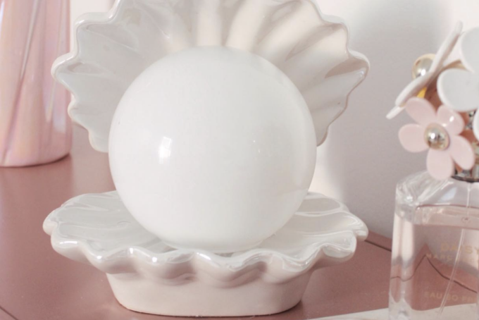
Pink & White
If you’re not ready to give up white walls, pink is the perfect color to match them. Light and expressive, it complements the clean aesthetic while adding an interesting pop of color. The key to mastering this duo is selecting a shade that’s airy and playful—think rose, blush, or a creamy strawberry. These hues have just enough color to make a blank white room feel interesting without overpowering or washing it out.
Most Popular
popular posts
Decorate
Access design inspiration that infuses personality and culture into your spaces.
Spaces
Whether it’s luxury or ease, every area of your home should be as fabulous and unique as you.
Mermaidcore Decor: The Ultimate Feminine Upgrade for Your Home
by Erika Hardison | September 7, 2023

FOLLOW ALONG ON INSTAGRAM
#homeandtexture
Find us on social for more home inspiration where culture, personal style, and sophisticated shopping intersect to help you create a home where you love to live.