By Kelsey Marie
September 18, 2025 at 3:47 PM PST
This year’s fall hues prove that seasonal decor goes way beyond pumpkin spice.
This year’s fall hues prove that seasonal decor goes way beyond pumpkin spice.
Fall has always been fashion’s favorite season, but lately, it feels like interiors have claimed it too. There’s something about the air shifting—brisk mornings, early sunsets—that makes us want to reimagine our spaces. Color is often the first way we welcome the season in, and this year’s palettes are as cozy as they are unexpected. Forget the predictable pumpkin-orange overload. The shades we’re drawn to now feel richer, moodier, and layered with personality—just like the homes we’re creating.

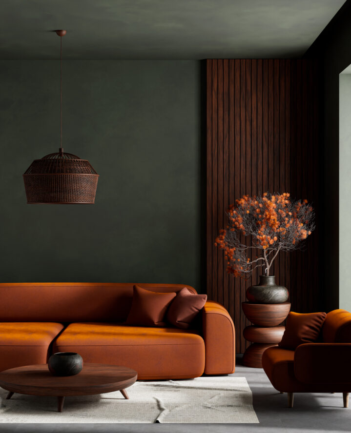
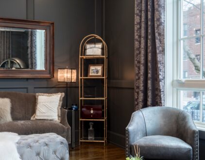
Brown has been slowly making its way back to interiors, and this fall it’s officially arrived. But we’re not talking about the dated espresso finishes of the early 2000s. Think velvety chocolate couches, walnut dining tables, or even a deep brown accent wall. When paired with sage green, the palette feels grounded, like bringing a forest walk indoors. Together, these shades balance earthiness with freshness, offering a palette that feels rooted but never heavy.
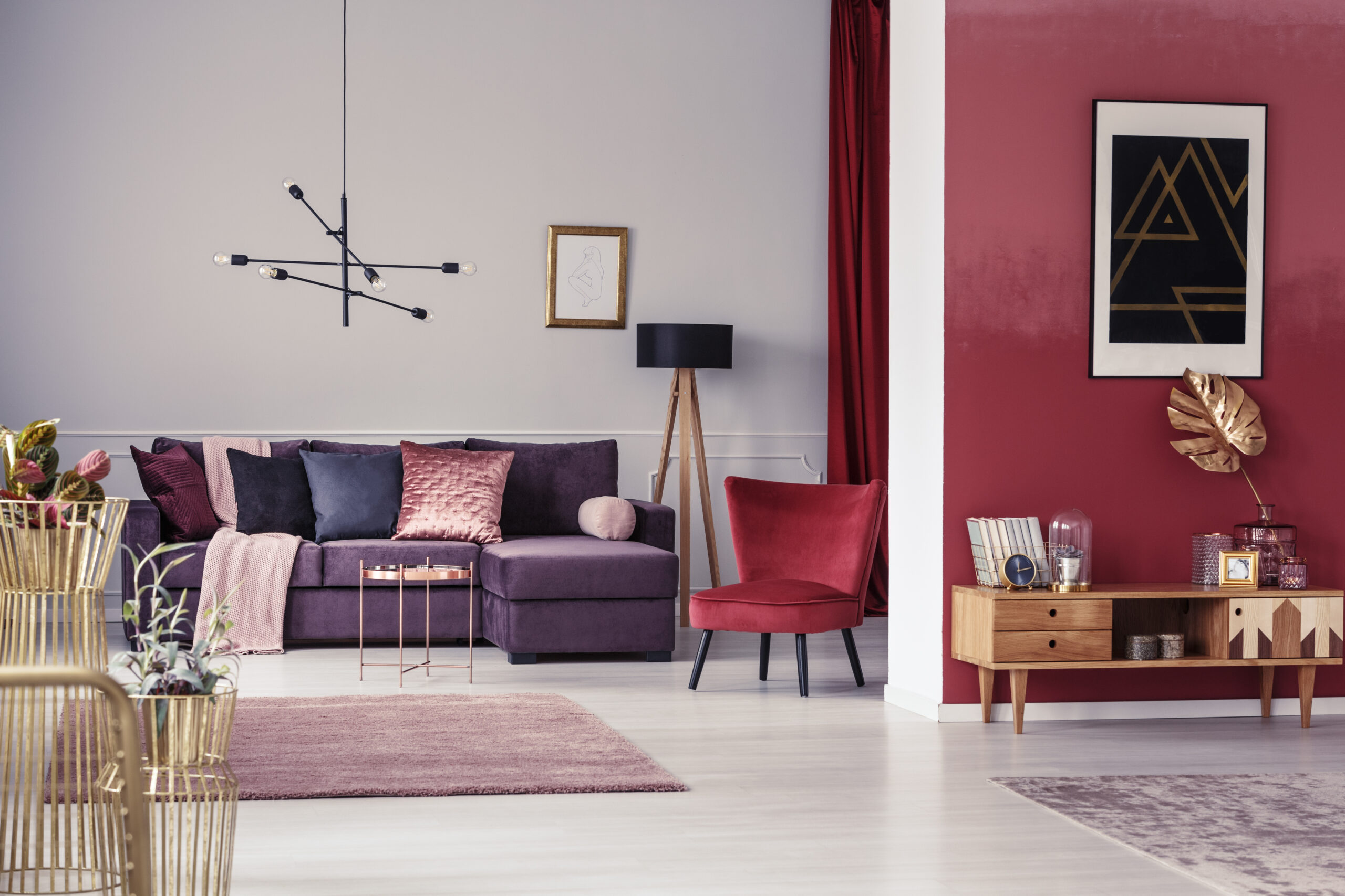
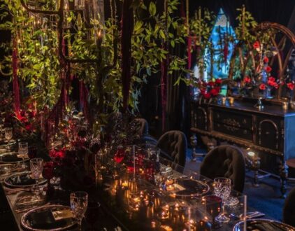
If fall had a signature color, burgundy would be it. But paired with dusty rose, it’s suddenly modern, playful even. The contrast between depth and softness creates a visual tension that feels both romantic and grown-up. This palette works beautifully for textiles—throw pillows, rugs, or drapery—where layering tones builds dimension. It’s also perfect for entertaining: a burgundy tablescape with blush-toned candles makes dinner at home feel like a restaurant-worthy moment.
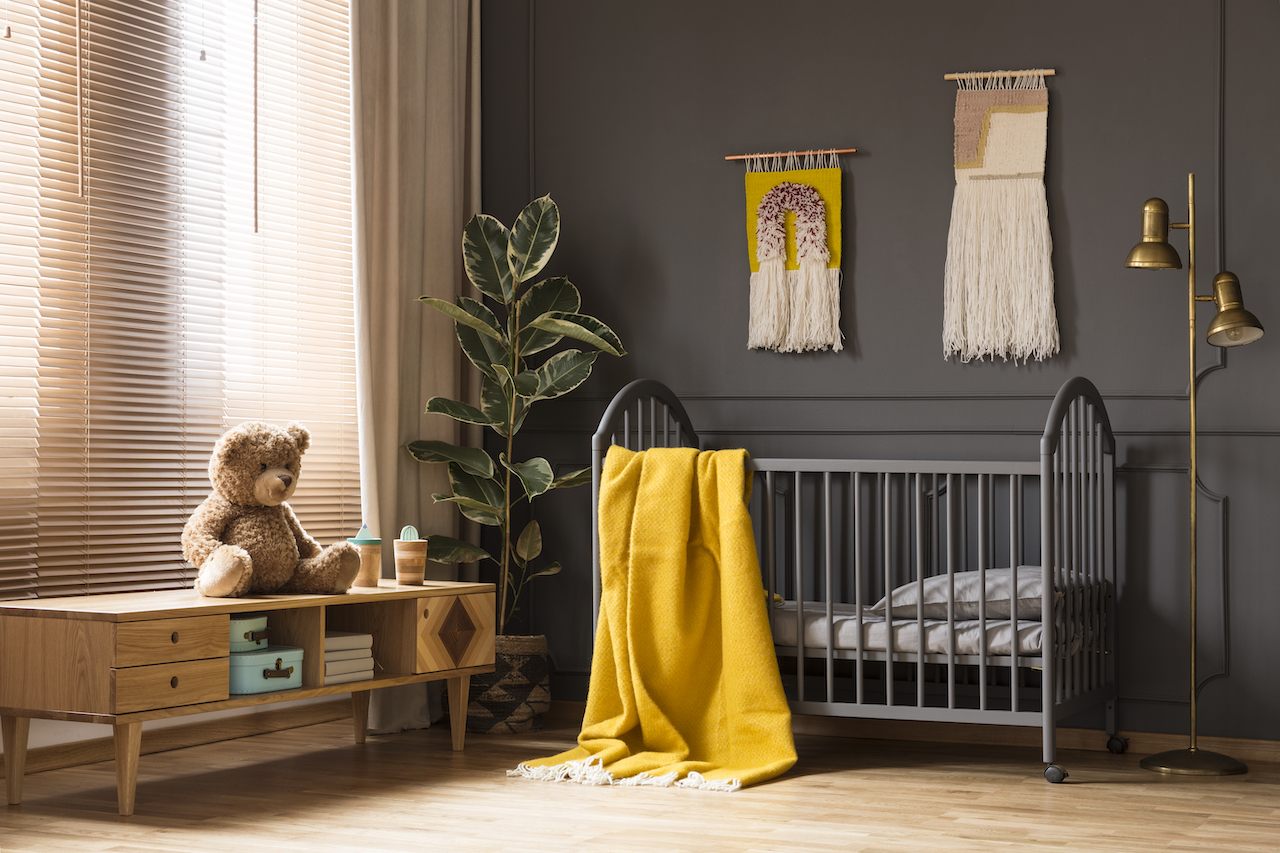
Ochre might be the most underrated fall shade, living somewhere between marigold and mustard. It radiates warmth but also sophistication, especially when tempered by charcoal gray. This pairing makes sense in spaces where you want energy and grounding in equal measure. Picture an ochre velvet chair against a charcoal accent wall, or small pops of yellow-gold through ceramics on a moody shelving unit. It’s dramatic, but in a way that feels curated.
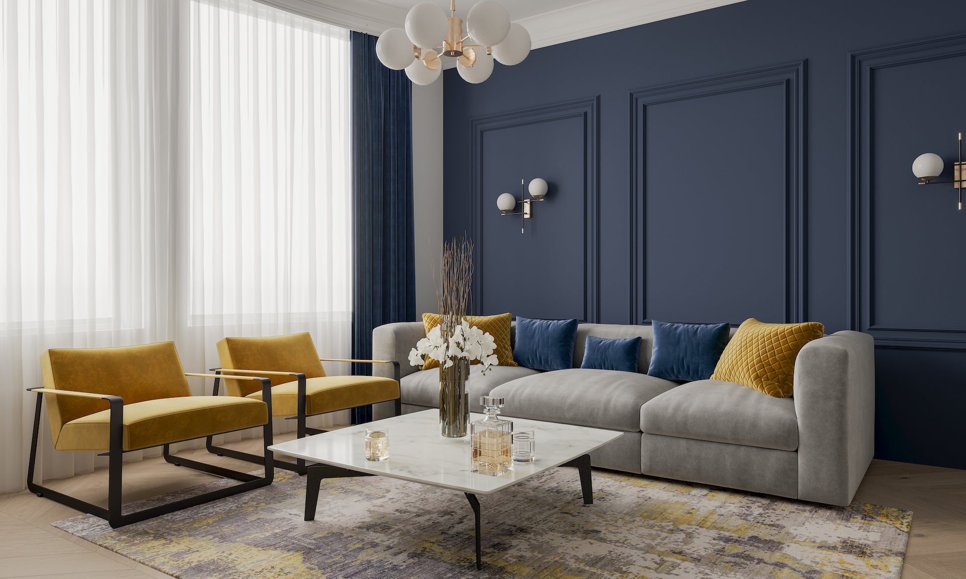
Blue isn’t usually a fall go-to, but when it leans inky and saturated, it brings a whole new kind of coziness. Midnight blue walls feel like an embrace, cocooning and chic. Amber, with its golden undertones, becomes the spark of light that keeps things from feeling too dark. Together, the palette feels cinematic, almost like a Wes Anderson set piece. It’s ideal for those who want their spaces to lean dramatic but still liveable.
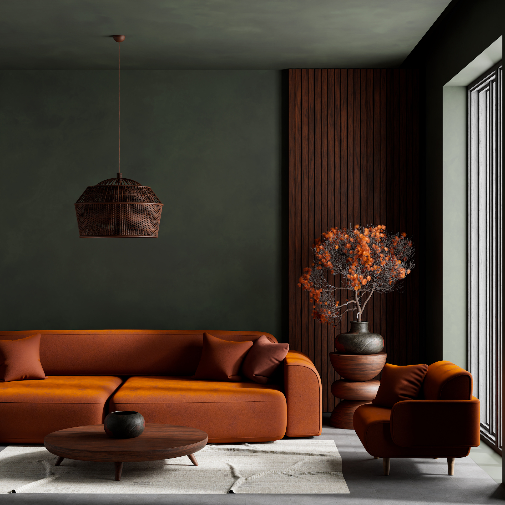
Olive and terracotta feel like old friends of fall, but this year they’re showing up in subtler, more versatile ways. Instead of the typical rustic approach, try matte finishes and clean-lined silhouettes. A terracotta lamp base or olive-hued ceramic bowl is a small touch that goes a long way. Together, they create a sense of timelessness—the kind of colors that will look just as chic next year as they do now.
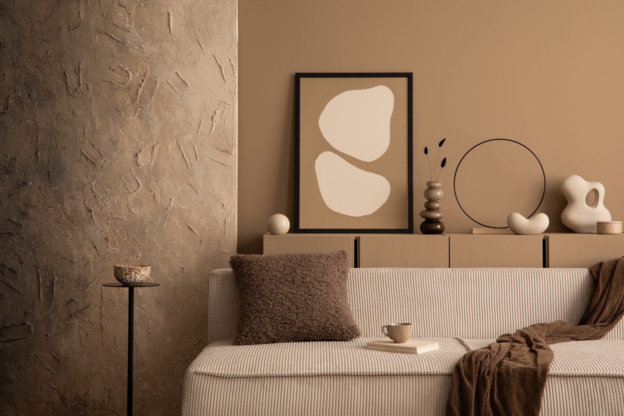
For minimalists, this one’s for you. A palette of warm mocha paired with soft cream layers texture without overwhelming the eye. It’s tonal, sophisticated, and endlessly calming. The beauty of this pairing is in its versatility: it can lean modern when paired with sleek lines, or cozy when brought in through tactile materials like boucle, linen, and wool. It’s the perfect backdrop for seasonal accents, letting you rotate in bolder shades when you crave them.
Fall’s 2025 color story is about balance: deep shades paired with unexpected softness, moody hues offset by warmth. It’s about moving beyond cliches and leaning into palettes that feel layered and lived-in. Whether you’re ready to repaint a room or simply swap out your throw pillows, color is the easiest way to signal a seasonal shift. And this fall, the shades we’re loving are as much about comfort as they are about style.
Access design inspiration that infuses personality and culture into your spaces.
by Kelsey Marie | October 17, 2023
by Brittni Williams | September 28, 2023
Whether it’s luxury or ease, every area of your home should be as fabulous and unique as you.


Find us on social for more home inspiration where culture, personal style, and sophisticated shopping intersect to help you create a home where you love to live.