December 13, 2024 at 12:40 AM PST
Decorate jewel tone design
Finding Balance Between a Splash of Color and the Jewel Tone Color Palette
When you want to make your room a "mood" without dampening the mood, pick your colors wisely.
Decorate jewel tone design
Finding Balance Between a Splash of Color and the Jewel Tone Color Palette
When you want to make your room a "mood" without dampening the mood, pick your colors wisely.
December 13, 2024 at 12:40 AM PST
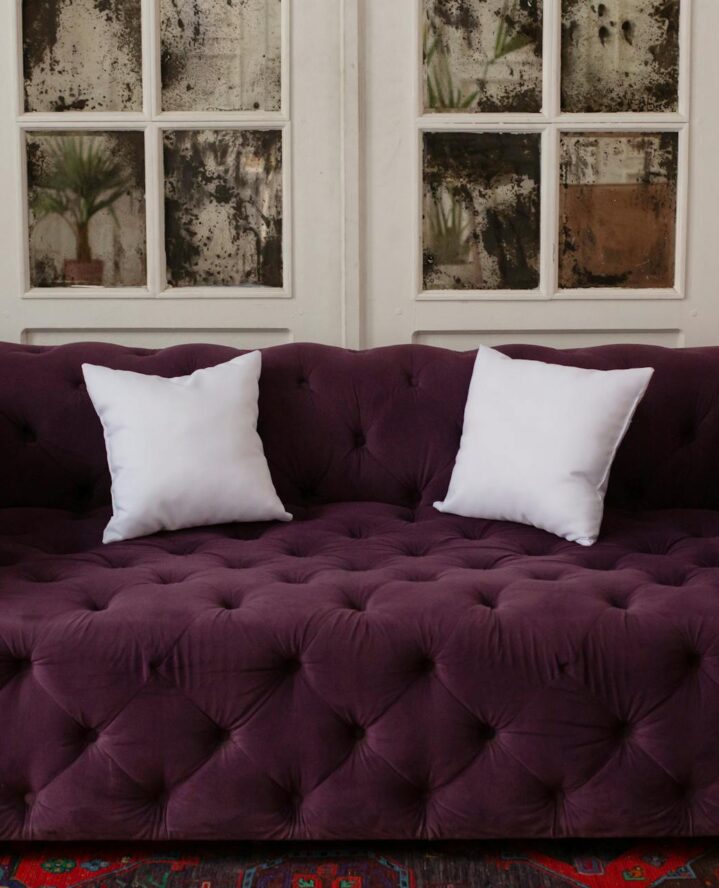
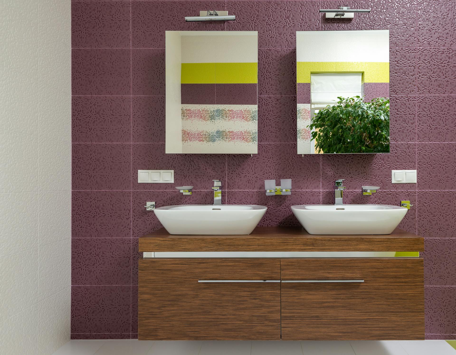
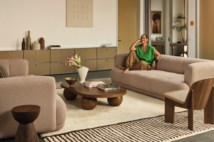
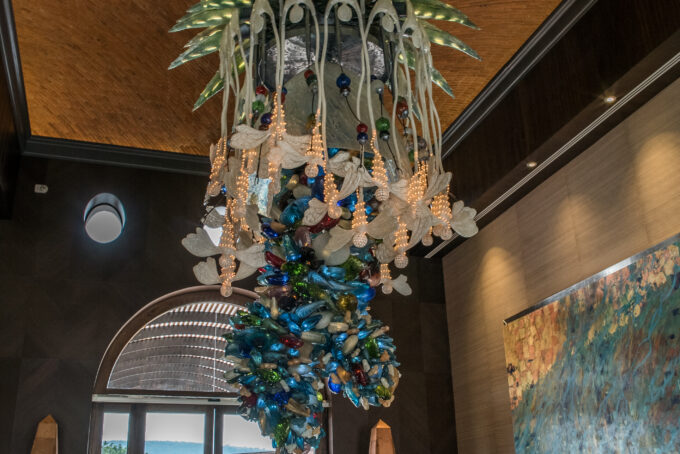
When you first hear the phrase “jewel tone color palette” and “interior design” in the same sentence, it may bring up ideas of bedazzled purses and Barbie homes (or Jem and the Holograms). And when it comes to colorful, eye-catching patterns, you wouldn’t totally be wrong. Jewel tone color palettes are not subtle. Think of eye-catching colors in red, blue, yellow, green and purple with a touch of black. That’s the goal with this rich design choice.
How can you decide if a jewel tone color palette fits into your space, and what are the tricks to managing the dark and lighter tones of this luxurious trend? If you want to dip into jewel tones but aren’t sure where to start, here’s some food for thought.
Knowing the Difference Between Colorful Interior Design Versus Jewel Tone Color Palettes
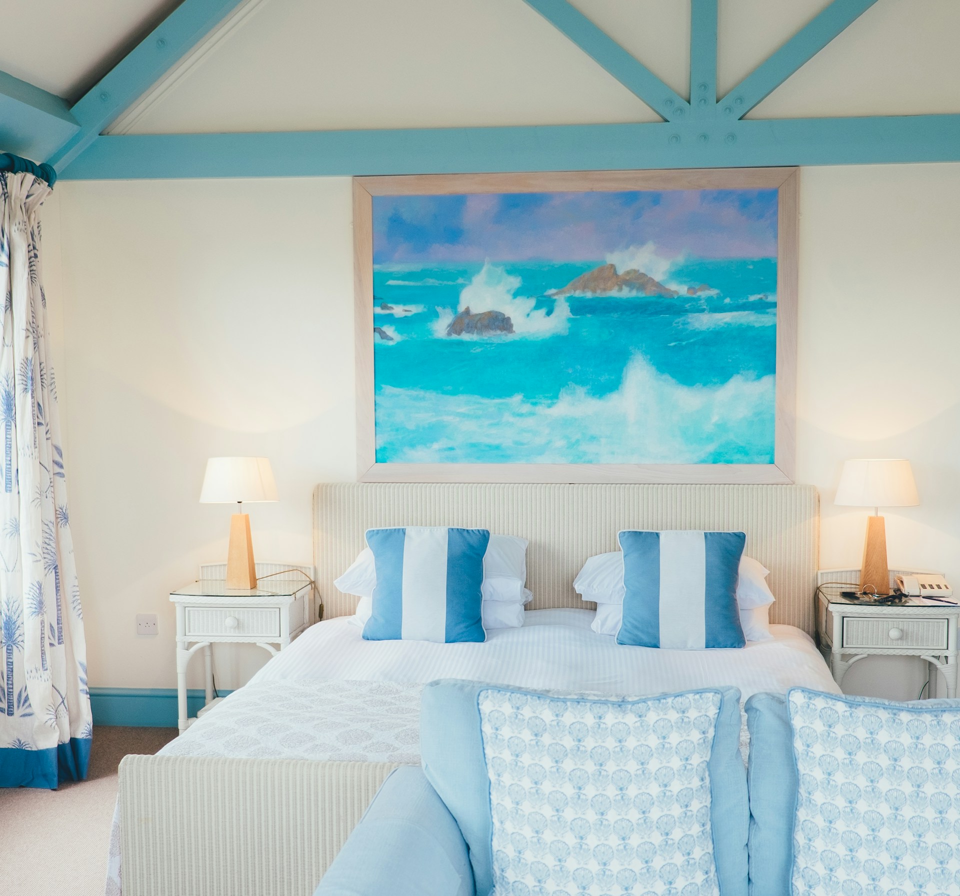
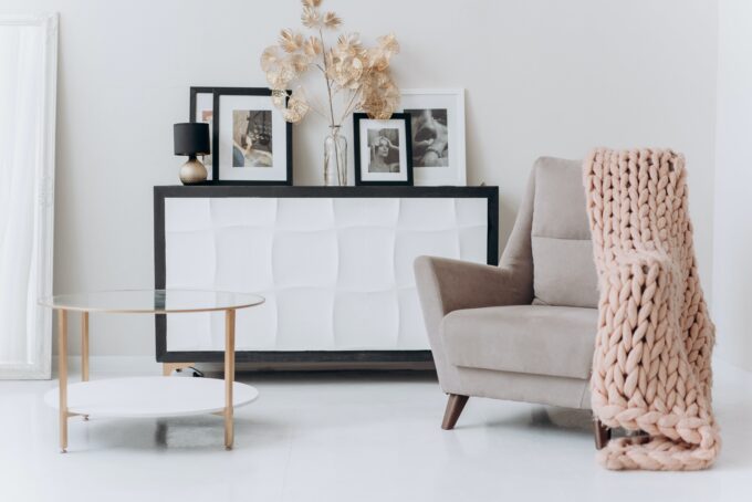
If you have a piece of statement furniture in your home, you’re already incorporating color in your interior design. That bright blue room that looks like it fell out of the clouds is warm and makes you think of the beach, but it’s not a jewel tone color palette interior design. The latter has a darker pattern.
Jewel tone colors are a little darker, a little edgier, a little more rock n’ roll. They’re not morbid colors, but they do have a spiritual and mildly erotic vibe in a room. In Mea Culpa, Kelly Rowland and Trevante Rhodes weren’t in bubblegum pink rooms for a reason. The color of the room (sometimes) sets the tone for what this room should be used for.
When Jewel Tone Color Palettes Stand Out Versus Blending In
Any time you use a decadent color in a neutral room, eyes are usually going to be drawn to it. So it’s up to you whether you want to have this one statement piece of furniture or a painting versus making the whole room pop. For example, if your kitchen has a maroon microwave, maroon tea kettle, maroon toaster oven and maroon pot holders, then it’ll clearly be obvious that that’s your favorite color. Still, it may take onlookers a little while to notice.
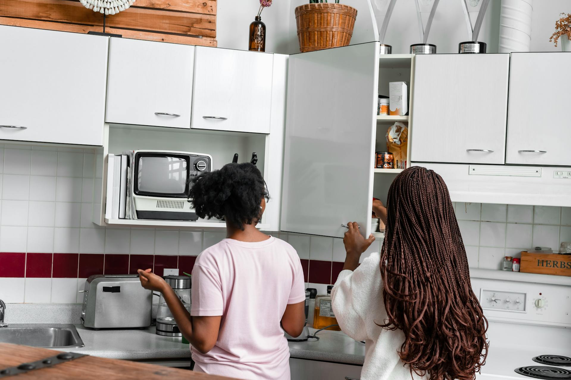
Now if you decide to install maroon ceramic tiles on your backsplash, all of those colorful appliances will suddenly be seen through new eyes. What may have been a coincidence before is now very much a purposeful design.
Testing Jewel Tone Color Palettes In Rooms To See What Works
You may not want to buy big-ticket items and realize that you don’t particularly like that color in that room. This is one of many reasons you should start small. You can even try adding something temporary in a room to see if you like how that jewel tone color looks. Try flowers with shades of citrine yellow or emerald green. Or, try throw pillows with sapphire blue, ruby red or amethyst purple in them.
Balancing Dark and Light With Jewel Tone Color Palettes
Because jewel tone colors are on the darker side, it’s very easy to end up making a room a little too glum. Balance is key here. There are shades of yellow and purple that fall into the jewel tone color spectrum. Try testing two of the same colors in different shades. This way, you get the sophisticated look with a little bit of cheer. Too much of any color, no matter how cool it may be, can be a little jarring on the eyes anyway.
And no matter which room you choose to use (or not use) jewel tone color palettes in, never be afraid to switch it up. It’s your home. Just as your mood changes, so can your room. As long as you don’t add anything too permanent that you don’t think you’ll like later, incorporating a jewel tone palette into your interior design can become a fun thing to do as the seasons change. Treat your home like a dopamenu, making every room a feel-good experience.
Most Popular
popular posts
Decorate
Access design inspiration that infuses personality and culture into your spaces.
These Are the Differences Between Vintage, Antique and Retro Home Decor
by Kelsey Marie | December 5, 2023

Spaces
Whether it’s luxury or ease, every area of your home should be as fabulous and unique as you.
What is Layering in Design and How to Try it in Your Home
by Melody Beuzelin | January 23, 2024
FOLLOW ALONG ON INSTAGRAM
#homeandtexture
Find us on social for more home inspiration where culture, personal style, and sophisticated shopping intersect to help you create a home where you love to live.