April 1, 2025 at 7:05 AM PST
Decorate Dark & Moody Blue Paint
Stormy Blue Is the Bold New Shade Replacing Millennial Gray
Stormy blue is the moody hue replacing millennial gray.

Decorate Dark & Moody Blue Paint
Stormy Blue Is the Bold New Shade Replacing Millennial Gray
Stormy blue is the moody hue replacing millennial gray.
April 1, 2025 at 7:05 AM PST
Like it or not, millennials are trendsetters when it comes to interior design color trends. Don’t believe me? Let’s take a look down memory lane at the facts. Millennial Pink redefined product packaging, ushering in a new and upbeat feel for everything from water bottles to cosmetic products. Then there’s Millennial Gray, which set the tone for minimal colors and monotone aesthetics. Things have changed, and today, the generation is embracing saturated tones instead of washed-out whites.
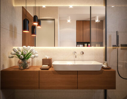
As color-drenching trends sweep the industry, millennials are taking note and shifting to deeper colors. One room, created by lifestyle and biotech content creator Kyyah Abdul (@kyyahabdul), is making waves across TikTok. Recently, Abdul took to the platform to announce that she was officially ditching Millennial Gray to give her office a moody makeover. Her color of choice? A deep, dark, stormy blue that would completely change the tone of the room.
@kyyahabdul Replying to @theashleewith2es Dark Night by @sherwinwilliams Customized in Roman Clay by @Portola Paints #homeoffice #homereno #blueroominspo
At this point, saturating a room with color is nothing new. However, what makes Abdul’s office stand out are the detailed touches. Instead of going with a jewel tone or velvety nude, she opted for a deep navy. In her post, she shares that she decided to go with the shade Dark Night by Sherwin Williams to create the mood. The color is designed with slate undertones to bring a slightly darker and more mysterious feel to navy. She remarks that it was the perfect shade of blue and a good starting point for her full vision.
To bring it to life, she decided to add a textural element to the paint with Portola Paint’s Roman Clay topcoat. The sealer adds a unique burnished finish to the paint and gives the walls a dimensional look. True to the color-drenching trend, she painted the ceiling and treated it to the same finish, and gave the door a glossy coat for contrast.
The combination of the deep color and textured finish makes a bold statement, so adding personal touches gave Abdul’s office a softer feel. Keeping with the moody palette, she chose a large oil painting with various shades of blue and other primary colors. It even has a similar rustic finish to match the wall’s new texture.
She then added creamy white furniture to offset the depth and bring light into the room. However, the goal was to maintain a moody look, which meant dimming the natural light. Choosing the right window treatments can be a tricky task. Blinds often let in too much sunlight, while room-darkening curtains can be too heavy. However, Abdul found a happy medium with Roman Shades and opted for a custom color to match her new office.
Most Popular
popular posts
Decorate
Access design inspiration that infuses personality and culture into your spaces.
Spaces
Whether it’s luxury or ease, every area of your home should be as fabulous and unique as you.

FOLLOW ALONG ON INSTAGRAM
#homeandtexture
Find us on social for more home inspiration where culture, personal style, and sophisticated shopping intersect to help you create a home where you love to live.