April 24, 2024 at 11:19 PM PST
Decorate Color Rule
How the 60-30-10 Color Rule Can Take the Guesswork Out of Interior Design
Streamline and simplify your design by following these simple ratios.
Have you ever walked into a room and it just looks cohesive, perfectly balanced and has just the right amount of color and design, almost as if it was copy and pasted from Pinterest? That’s no accident. It can be easy to go overboard with any particular color or pattern, but if you’re feeling like you need to give your room a refresh and don’t know where to start, the 30-60-10 color rule can serve as your guide. Use it to transform your space effortlessly and learn why it works so well.
The Science Behind the Rule
The beauty of the 60-30-10 color rule lies in its simplicity. Here’s how.
It creates visual harmony.
By proportioning your colors in a specific ratio, you create a sense of visual harmony that’s pleasing to the eye. Each color plays a distinct role in the composition, contributing to the overall balance of the space.
It’s easy to apply.
Unlike complex color theories that require extensive knowledge and expertise, the 60-30-10 rule is easy to understand and apply. You could be a seasoned designer or novice decorator and this rule is pretty much foolproof.
It’s flexible.
While it provides a solid foundation for your design, it also allows for plenty of flexibility and creativity. You have the freedom to experiment with different hues and textures so that you can create a look that reflects your style.
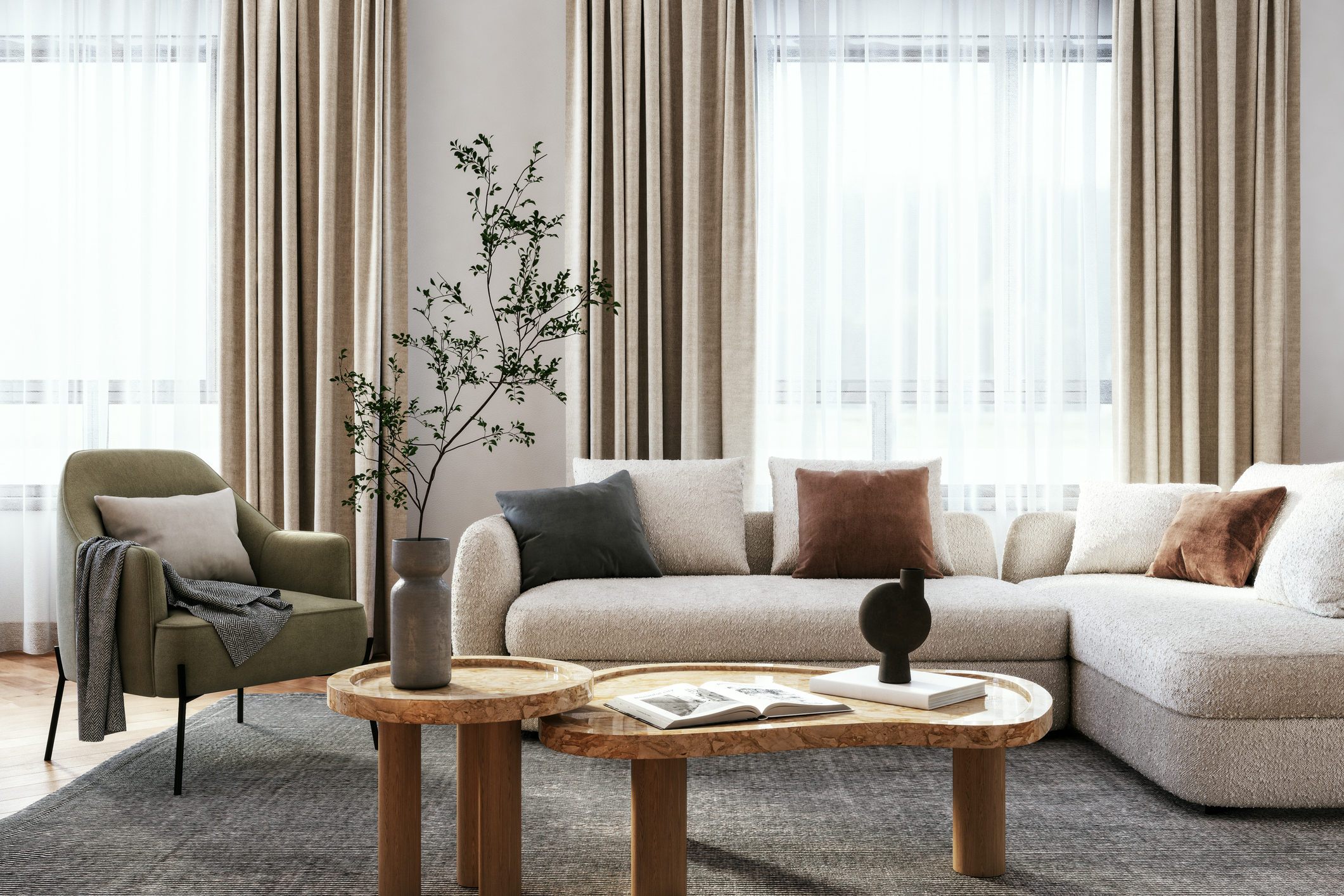
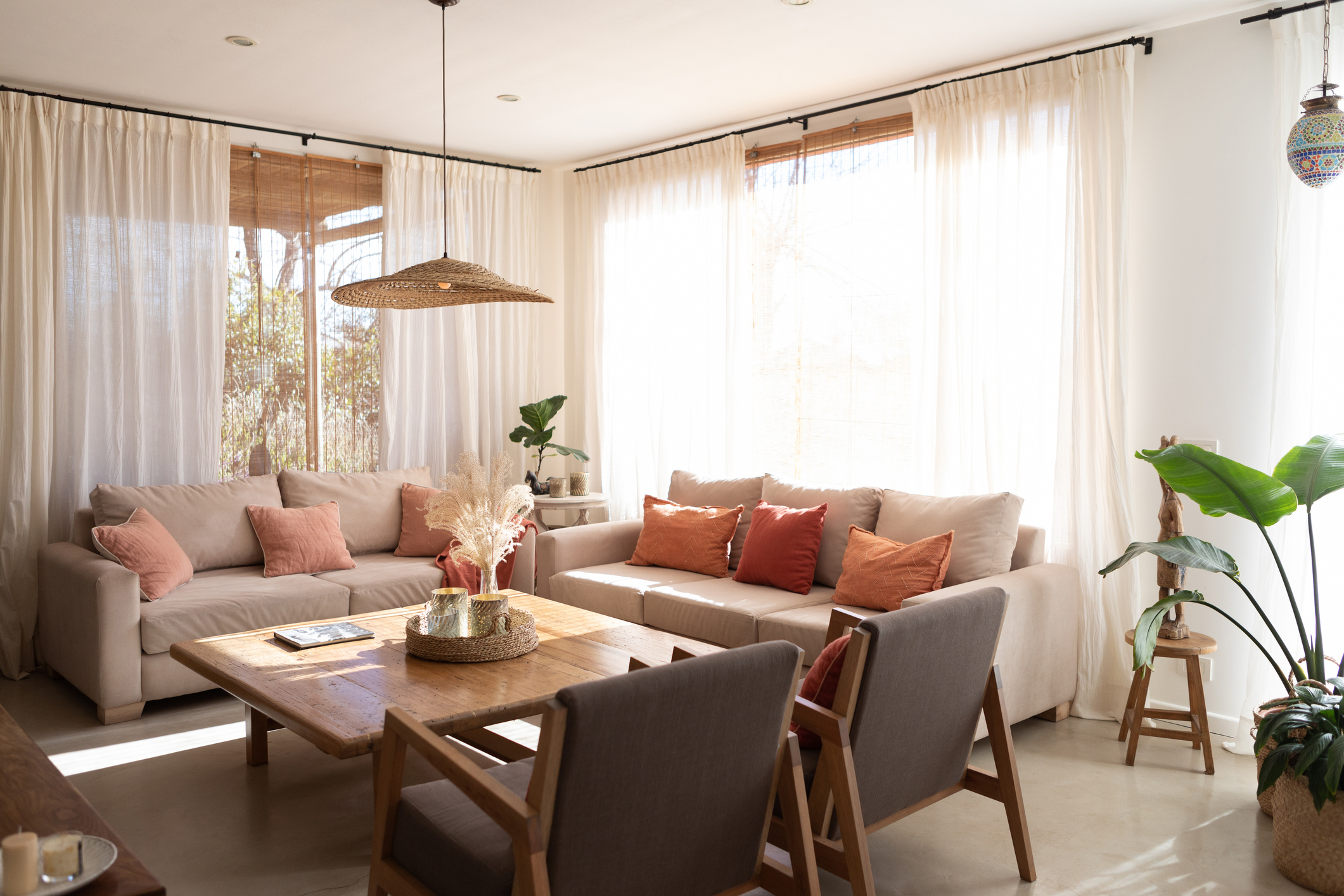
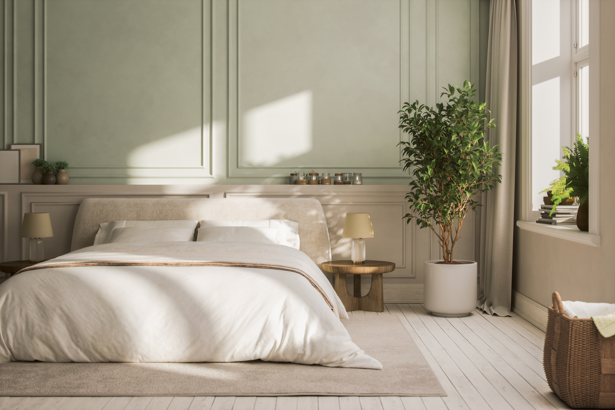
The Dominant Hue: 60 Percent
At the core of this rule lies the dominant hue, which occupies the majority of the look you’re going for—60 percent of your design canvas. This color serves as the foundation, anchoring the room with its timeless appeal. A calm or neutral shade lets the details in the rest of your palette shine, while a bold color will likely be the first thing someone notices.
The Secondary Shade: 30 Percent
The secondary shade takes up about a third of the space. This hue complements the dominant color, adding depth and dimension to your design. Think of it as the supporting actor – essential for elevating the overall aesthetic without stealing the spotlight.
The Accent Color: 10 Percent
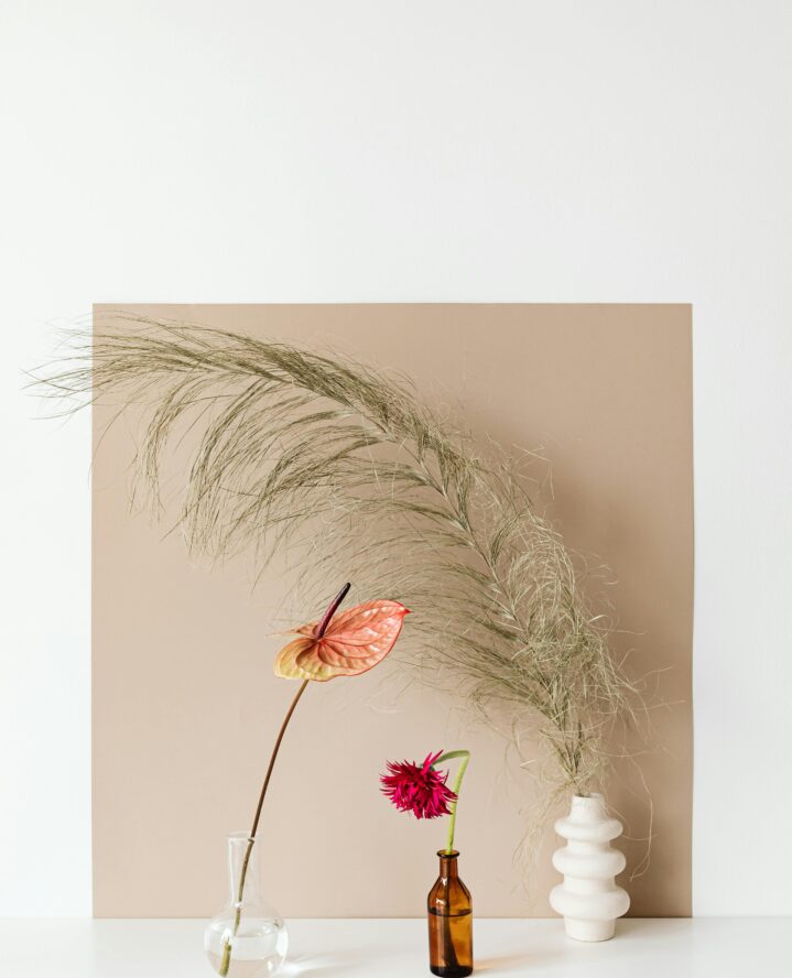
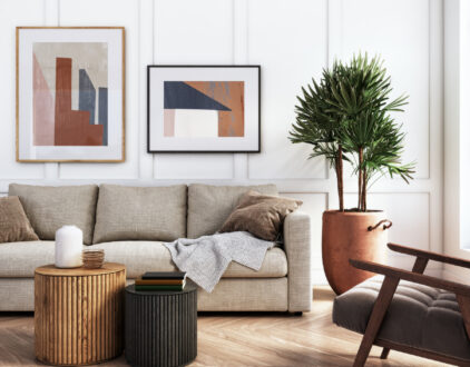
The accent color is the cherry on top, adding a little splash of personality. It accounts for a modest 10 percent, but depending on how vibrant it is could be a show-stopping focal point, such as an emerald green accent chair with a few climbing plants spread out across a greige and white palette. Or, it can match neutral hues to give the room a unified look and feel.
Tips for Bringing the Rule to Life
Here are some expert tips to help you incorporate this principle into your own interior design projects.
1. Start with a solid foundation.
This is arguably the most important part, so make sure it’s a cover you love to set the tone for the entire room, as the others can be a little more flexible if you do decide to change them up.
2. Layer on the depth.
Once you’ve established your dominant color, layer on the secondary shade. Look for hues that complement rather than compete with your chosen palette. For example, if your dominant color is a warm taupe, consider pairing it with a soft, muted green for added depth and visual interest.
3. Add a pop of personality.
Finally, sprinkle in your accent color to add a playful twist to the design. This is your chance to get creative and inject a dose of personality into the space. Whether it’s through artwork, throw pillows, or decorative accessories, let your accent color shine and add visual interest.
Most Popular
popular posts
- 1It’s Black Business Month, So Let’s Go Shopping and #BuyBlack!
- 2These Home Decor Items Will Instantly Make Your Space Look Outdated
- 3Black-Owned Home Decor Stores To Support Across the United States
- 4A Look Inside Elon Musk's Tiny $50,000 House
- 57 Black and Multicultural Designers To Follow For Design Inspo
Decorate
Access design inspiration that infuses personality and culture into your spaces.
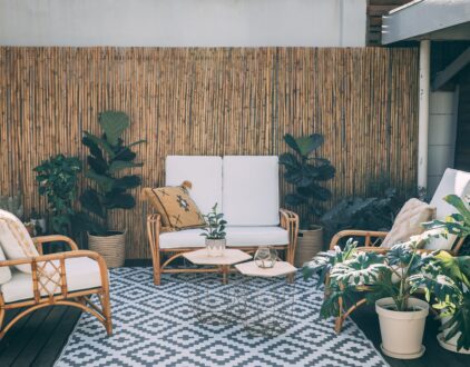
Up to 15% Off: 4 Best Patio Furniture Finds
by Stephanie Taylor | January 18, 2023
7 Black and Multicultural Designers To Follow For Design Inspo
by Marissa | January 18, 2023
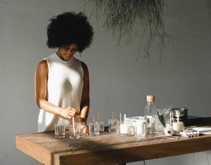
These Candle Making Kits Will Elevate the Vibe of Your Home
by Arielle Clay | January 19, 2023
FOLLOW ALONG ON INSTAGRAM
#homeandtexture
Find us on social for more home inspiration where culture, personal style, and sophisticated shopping intersect to help you create a home where you love to live.
