By Kelsey Marie
February 26, 2026 at 4:56 PM PST
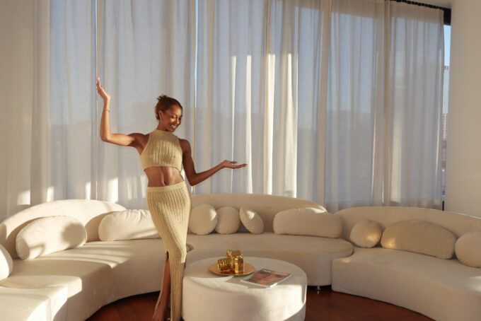
Proof that a neutral palette can still feel rich, dimensional, and deeply personal.
Proof that a neutral palette can still feel rich, dimensional, and deeply personal.
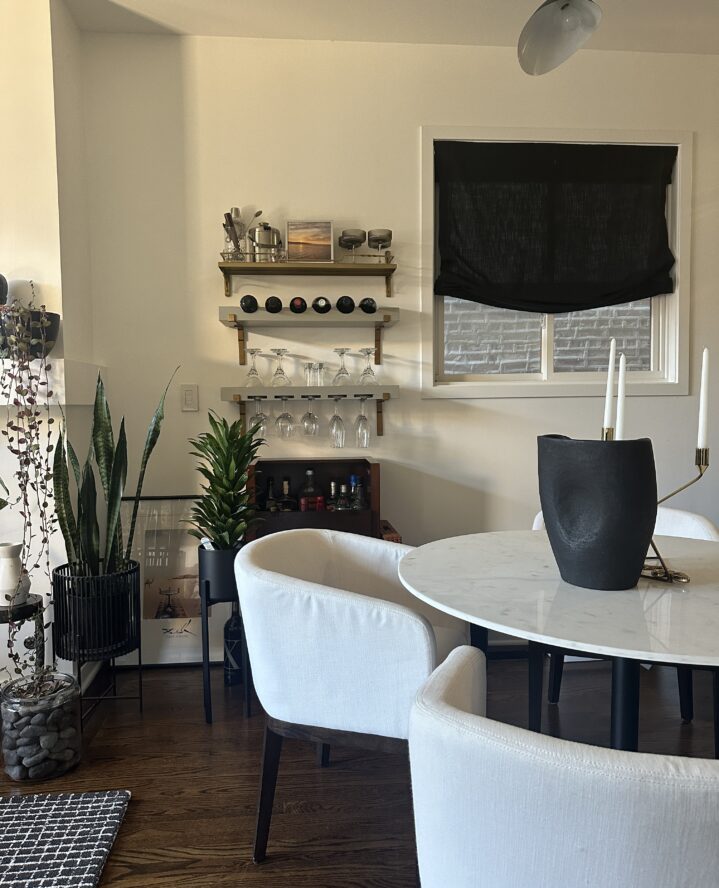
There’s a certain kind of ease that comes through in a home when nothing is fighting for attention. In Shanteé Hope’s 2,200-square-foot Chicago condo, the palette stays neutral, but the space never feels flat. Instead, it’s built on contrast and composition, with sculptural furniture, layered textures, and artwork that gives each room its own point of view.
Hope, an enterprise digital transformation consultant, describes her style as “modern and collected,” shaped by clean lines and a neutral palette, then warmed up with texture, pattern, and art. It’s a look that reads styled intentionally without looking like a showroom.
Hometown: Pensacola, Florida
Currently: Chicago, Illinois
Home Type: Condo
Size: 2,200 square feet
Status: Rent
Rent: $2,200
Beds: 3
Baths: 3
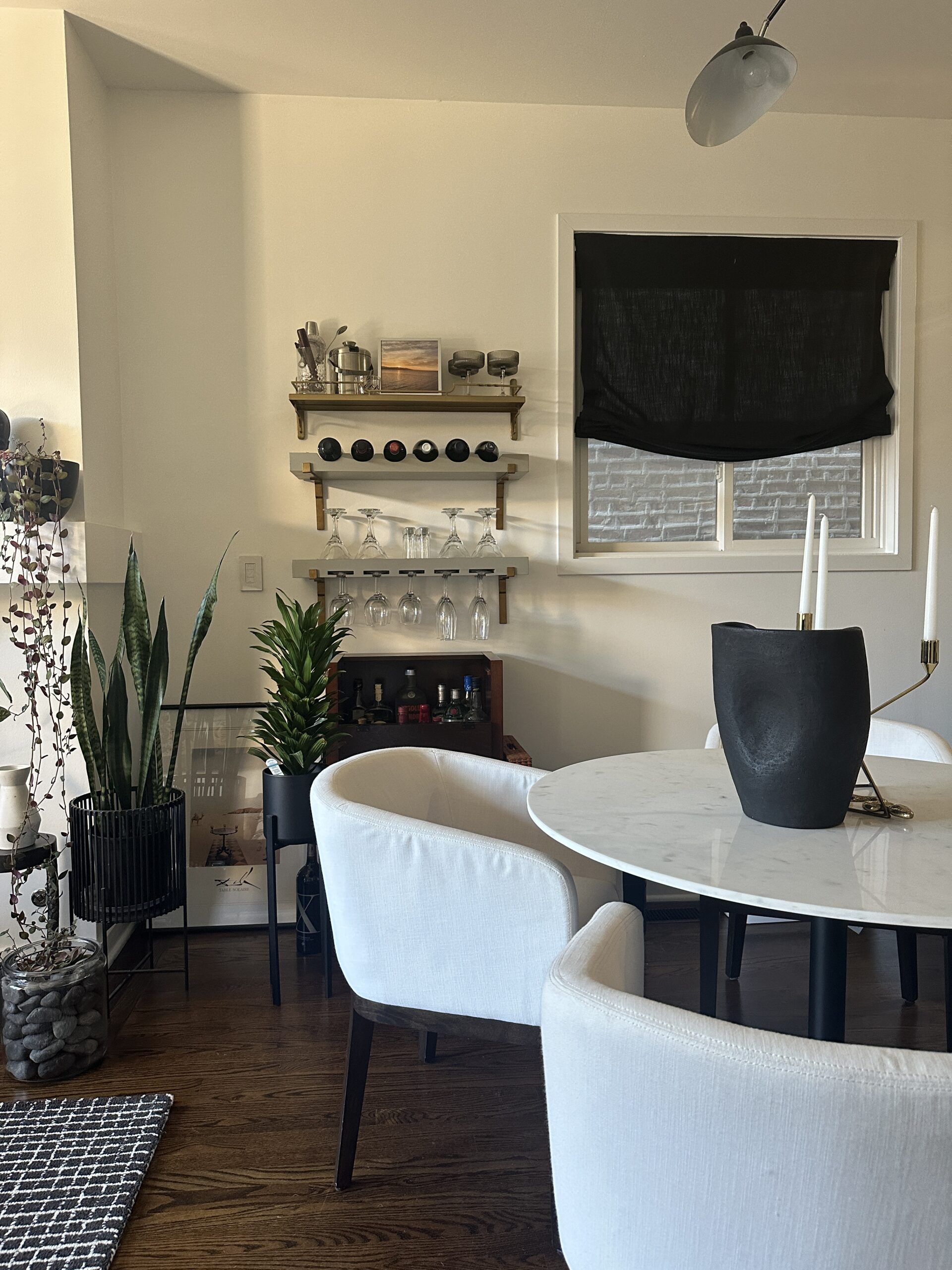
Even with a restrained palette, Hope’s home has range. Soft materials work alongside more structured, architectural shapes, which is where that “balance of soft and masculine elements” really shows up.
“I love that my home is as cozy as it is stylish,” Hope says. “There’s a calm harmony created by the mix of soft textures and stronger, more architectural furniture lines.”
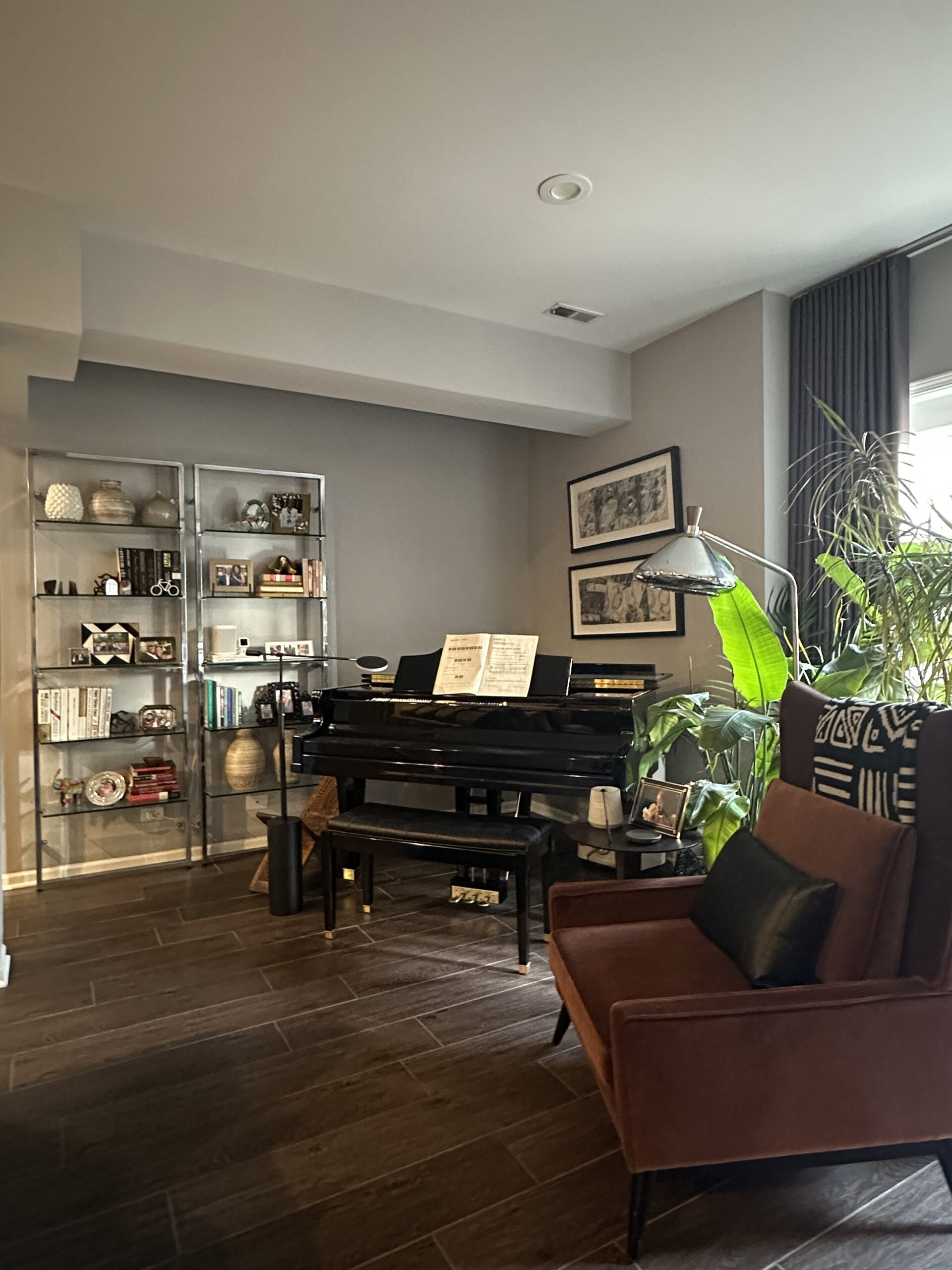
Plants are another through-line in the space, adding movement and life against the clean-lined foundation. They bring in softness and shape, and they make the home feel lived-in in the best way, especially when paired with the mix of materials throughout.
“The plants throughout my space bring a sense of life and grounding,” Hope says. “While my color palette is neutral, the variety of materials, patterns, and artwork adds richness and visual interest.”
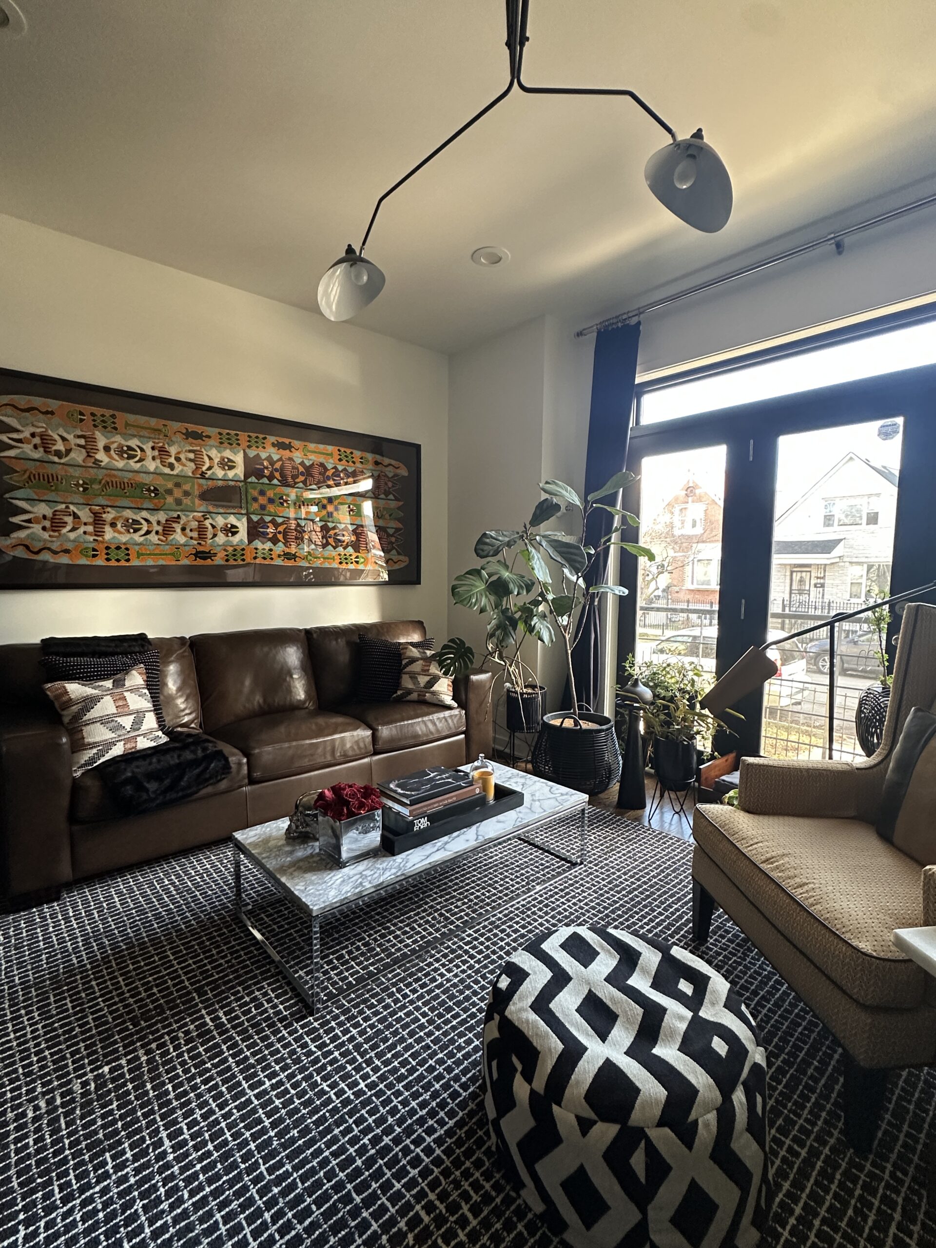
That layering shows up most clearly in the way the rooms are built. Neutrals sit on top of neutrals, but the space still has depth because the materials change. Upholstery plays off harder surfaces. Patterns come in subtly, not loudly. The overall effect feels grown, steady, and comfortable, like the home knows exactly what it is.
Art is one of the biggest anchors in Hope’s home, and it’s also her biggest investment. Her most expensive purchase of art, with pieces costing up to $4,000, which makes sense in a space where the palette stays consistent and the visual interest comes from form, texture, and what’s on the walls.


Much of the furniture and decor was sourced through FB Marketplace and CB2, a combination that reflects how the home comes together. It feels curated through patience and taste rather than a single shopping trip. Every piece looks like it earned its place, which is usually what separates a “neutral home” from a neutral home that has personality.
At the end of the day, Hope’s condo does what a good home should do. It feels restful, personal, and finished, without trying too hard. It’s proof that neutral design can still be expensive when the choices are specific and the layering is thoughtful.
Our favorite creators, designers, and home decor lovers showcase their personal spaces and styles.

by Kelsey Marie | February 11, 2026

by Savannah West | April 16, 2025

by Stixx Matthews | February 12, 2025
Whether it’s luxury or ease, every area of your home should be as fabulous and unique as you.
Find us on social for more home inspiration where culture, personal style, and sophisticated shopping intersect to help you create a home where you love to live.